
I am, by training, a graphic designer. I am also a card player, mostly euchre but so many more besides. One of the big draws to Malifaux for me was always the curious card system rather than dice. When I saw the default fate deck, I was unimpressed. I immediately thought about making a deck attempting to integrate the symbols; I've had thoughts of messing around with the distinctive look and feel of cards before, and here was a reason! Then, as I circled ever closer to purchasing and playing Malifaux, I discovered a thread regarding the forum-spawned old school deck, and knew I had to get one.
When I got it, for all the awesome it has, there was an issue: The cards are plastic. Not plastic-coated paper, like most you'll see, but fully plastic. If you are a card player, you know that they are just not up to snuff for most games. They slide wrong, they're thicker, they don't quite shuffle right, etc.
Other than that, beautiful deck. Wonderfully integrated symbols, a nice old-school touch, and very much a feel of a deck that returning colonists discovered in the parlours of Malifaux from the first excursion: Still playable, but warped, aged, and a little off.
So I got to thinking: I'd wanted to design a deck, and here was a reason. I wanted a different feel though: The old-deck (If someone can remember who made it, I'd love to know) looks just that: Very vintage. That kind of ink crazing happens after a long time, and the cards are well beaten up. I wanted to do a deck which is designed in the style you could theoretically walk into a store Earth-side or in Malifaux 'today' and buy.
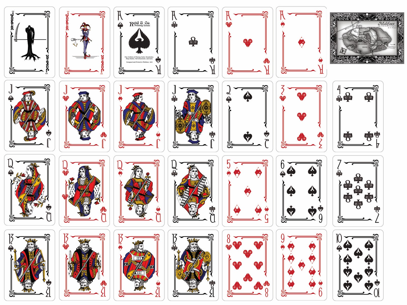
Considering the effects of the jokers, I made the black joker a grim reaper, (much like Xander's Retro deck: See the original here.) but wanted to make it feel even more like a 'real' deck, and so kept the art pattern simple, and then copied the pose for the red joker: A true jester, but still morbid: Skull wand, creepy expression, etc.
The four symbols, while heavily inspired by the old-deck, were done without any direct reference. I wanted them to be unique, and to answer the challenges my own way. I insisted that the shapes be as analogous as possible, which forced some odd bends to the crows, and necessitated the tassels for the masks. Since the 'heart' suit is now "Rams", each symbol is two ram skulls aligned as though butting against one another.
Similarly, the numbers were inspired by typefaces popular at the time, with the J(11), Q(12) and K(13) coming first, and then informing the Ace(1) and other numbers thematically.
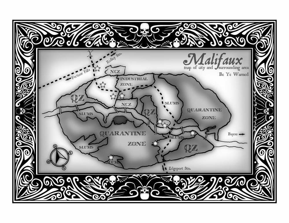
I struggled for a while with the back design. Card design over the centuries has seen simple patterns, photographs, or often just blank backsides, but I wanted to go more the bicycle route. Initially I tried integrating the steampunk feel but it just felt too forced. Eventually I settled on what I figure any visitor to Malifaux would want on their handy, ever-accessible deck of cards: A map of Malifaux's regions.
Finally came the challenge of the spade ace. I knew I wanted to make the deck as like a real one as possible, and here the rivet-counting ways flared in. Through research, I discovered that the reason Aces of, specifically, Spades have such fancy designs has to do with tariffs once applied to things like decks of cards. Rather than having a slip of paper with every deck sold to prove its print house had paid its dues, card makers made the first visible card in the deck have it on it. This also served as part advertisement, and gradually evolved into the very fanciful ace we have today.
Well, with that knowledge, I couldn't have each suit with a fanciful Ace, as there'd be no historical bearing for it. Clubs (Tomes), Hearts (Rams), and Diamonds (Masks) were relegated to normal status, but I had to do something fancy for Spades (Crows).

For final thoughts: I welcome any critiques, especially on the face cards, back of deck, and Ace of Spades. I'm mostly on the final cleanup now, and will likely also be getting a cream-coloured paper to photograph, and add as texture to the cards before sending them off to print. There's a company that offers to make decks and I am hoping the prints will work out. I'll test-run it first on a laser-printer, to make sure the detail is not too fine. If folks want a more detailed look at the various suit cards, I can add them in my next update when I can finish off the ace.
It's been a fun process; my Illustrator file is sprawling with layers to keep everything aligned properly!
Wow! These look amazing! Any chance you could provide the files and printer info if others wanted to order some?
ReplyDeleteThanks! A couple of things will have to happen first. Since I'm using Wyrd's map design for Malifaux, I'd like a sign-off from them that they're okay with me using it. Then I will be doing a local print run to see if it all works the way I want. The problem is that the printing company wants all jpgs or similar, and mine is a big working illustrator file with about 70 layers it feels like by now. If I get a release from the various folks I need to, I may either post it online or find some other means. Stay tuned!
DeleteHello sir. Any updates on this project? I'd buy one in a heartbeat. The fully plastic decks Wyrd makes are spill-proof, and that's nice, but they feel wrong as a deck of cards.
ReplyDelete